We are currently working on a website audit, which will result in a complete revamping of the City’s site. This process will take some time, so we decided to spruce up the current site just a little bit with the hopes that it’ll be easier to navigate. Recent changes include:
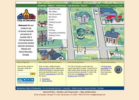
1.) Replacing the “Quick Links” in the top bar with “Residents,” “Visitors” and “Businesses” drop down menus (see image above).
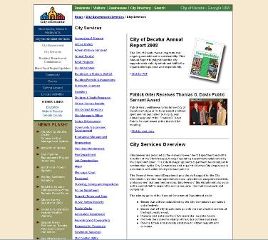
2.) Expanding the links on the left sidebar on interior pages (see image below).
3.) Changing the color scheme slightly to more earthy tones (see images above and below). These are the same colors that we use on the Shopping, Dining and Services map and the maps on the outdoor kiosks.

These minor changes won’t revolutionize the way you use the site, but hopefully they’ll make it a little more user-friendly. Feel free to leave a comment and let us know what you think.